

2017 1967
The winning design for Canada's Sesquicentennial anniversary is a rip off from the winning design for the Centennial Anniversary.
Both represent the Maple Leaf, although the 150th designer does so somewhat reluctantly.
And both are stuck on "multiculturalism."
I've said many times that "multiculturalism" makes for bad design.
Here is an article I posted at Camera Lucida in 2008:
--------------------------------------------------------------------------------------------------------
July 19, 2008
How Multiculturalism Infantilizes design
I haven't yet read Diana West's book The Death of the Grown-up, but here is an interesting insight she makes while answering questions on an interview on National Review Online:
Kathryn Jean Lopez: How are “dhimmi life under Islam” and “PC life in a multicultural world” similar?I remember looking at logos of institutions who stressed diversity either in their title, or in their mission statements, and found this very same infantilizing going on at the design level.
Diana West: For me, this pairing was something of a “eureka” moment in the writing of the book.
I would describe PC life in a multiculti world as being marked in part by self-censorship based in fear — fear of professional failure, opprobrium or social ostracism. I would also describe this same self-censorship as a form of childishness. During one lecture on The Death of the Grown-Up, I took a question from a man who wondered, in a rather agitated way, if I were actually saying that multiculturalism is juvenile. I hadn’t phrased things that way, but, on quick reflection, I told him that, yes, that was indeed what I was saying. The fact is, buying into multiculturalism — the outlook that sees all cultures as being of equal value (except the West, which is essentially vile) — requires us to repress our faculties of logic, and this in itself is an infantilizing act. I mean, it’s patently illogical to accept and teach our children the notion that a culture that has brought liberty and penicillin to the masses is of no greater value than others that haven’t. In accepting the multicultural worldview, we deceive ourselves into inhabiting a world of pretend where certain truths are out of bounds and remain unspoken — even verboten.
Since there are no standards, that everyone and everything is equal, logo designs stress the equality of all these elements to the detriment of their design.
I've already talked about the COSTI Immigrant Services logo, which went from a lovely clear red line, as though traveling into to the horizon, to me signifying the release of the new immigrant into the bigger and greater society, into a disheveled, hardly stable umbrella which is trying hard to shade all those diverse elements under its inadequate roof. By forfeiting their strong message of "you can make it," they turned it into a half-hearted, insincere, "we'll protect you."
The same with the Ontario logo design which had a solid, identifiable trillium and withstood all the elements for several decades, until diversity entered the vocabulary. The logo devolved into three stick-figure like objects, hardly resembling the strong structure of the original.
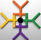
Stick figures abound in diversity logos, as well as bright crayola colors. How childish can they be?
So, yes, as Diana West says, multiculturalism does infantalize. And a logo doesn't lie.
I wonder how long before either we change these logos (I hope COSTI comes to its senses), or we abolish these institutions altogether.
Here are a selection of logos I found just by googling: Canada diversity.
 |  |
Right: Canada's Best Diversity Employers
 |  |
Right: Harmony Movement
 |  |
Right: Ontario's new logo resembling stick figures
 |  |
Right: Hamilton's Centre for Civic Inclusion
Even those that seem to show some form of artistic design - for example, some idea of composition etc. - actually show their weaknesses through obvious signs of childishness.
These two from Culturescope.ca look interesting (although there is actually nothing to see, hence another indication of a lack of good design) but also have scribbles of lines going through them.
 |
And there are many more.
Addendum: Culturescope.ca no longer exists. As this website indicates:
As a result of a Strategic Review of Government of Canada, Culturescope.ca has been discontinued since April 1st, 2008 as the original program objectives have been fulfilled. The digital space has evolved tremendously since the Canadian Cultural Observatory was created in 2003 and the website still contains rich resources and documents on diverse thematic areas.The evolution of culturescope.ca fulfilled these objectives:
The Canadian Cultural Observatory (Observatory) and Culturescope.ca: The Department of Canadian Heritage launched the Observatory in November 2003 to provide statistics and information on cultural and heritage policies, programmes, legislation and regulations. Its objectives are to advance cultural development in Canada by fostering responsive research, encouraging informed decision-making in policy and planning, and stimulating community debate and improved knowledge exchange. Culturescope.ca is the Observatory's collaborative, interactive website developed in partnership with the not-for-profit, private and public sectors...[Source]But we still keep coming back to those multi-culti stick designs.