About.......Contact.......Society.....................
Showing posts with label Design. Show all posts

Friday, June 23, 2017

Barrie's New Logo


“Barrie is youthful and bold,” marketing and communications manager Cheri Harris said. “It is a community deeply connected to its past, the parkland and the adventures it provides. The city is innovative and entrepreneurial. With borrowed elements from the past, and the strength of the corporate colour preserved, Barrie looks forward to its future.” [Source]

Saturday, June 3, 2017

Thirteen Provinces and Multiculturalism?


These were the alternate designs submitted to a focus group.

But why wasn't the simple 13 maple leaves design, representing the thirteen provinces, within two thin blue circles, chosen?

But then, where would they put all that multiculturalism?

How Multiculturalism Infantilizes design


2017 1967
The winning design for Canada's Sesquicentennial anniversary is a rip off from the winning design for the Centennial Anniversary.

Both represent the Maple Leaf, although the 150th designer does so somewhat reluctantly.

And both are stuck on "multiculturalism."

I've said many times that "multiculturalism" makes for bad design.

Here is an article I posted at Camera Lucida in 2008:

--------------------------------------------------------------------------------------------------------

July 19, 2008
How Multiculturalism Infantilizes design

I haven't yet read Diana West's book The Death of the Grown-up, but here is an interesting insight she makes while answering questions on an interview on National Review Online:
Kathryn Jean Lopez: How are “dhimmi life under Islam” and “PC life in a multicultural world” similar?

Diana West: For me, this pairing was something of a “eureka” moment in the writing of the book.

I would describe PC life in a multiculti world as being marked in part by self-censorship based in fear — fear of professional failure, opprobrium or social ostracism. I would also describe this same self-censorship as a form of childishness. During one lecture on The Death of the Grown-Up, I took a question from a man who wondered, in a rather agitated way, if I were actually saying that multiculturalism is juvenile. I hadn’t phrased things that way, but, on quick reflection, I told him that, yes, that was indeed what I was saying. The fact is, buying into multiculturalism — the outlook that sees all cultures as being of equal value (except the West, which is essentially vile) — requires us to repress our faculties of logic, and this in itself is an infantilizing act. I mean, it’s patently illogical to accept and teach our children the notion that a culture that has brought liberty and penicillin to the masses is of no greater value than others that haven’t. In accepting the multicultural worldview, we deceive ourselves into inhabiting a world of pretend where certain truths are out of bounds and remain unspoken — even verboten.
I remember looking at logos of institutions who stressed diversity either in their title, or in their mission statements, and found this very same infantilizing going on at the design level.

Since there are no standards, that everyone and everything is equal, logo designs stress the equality of all these elements to the detriment of their design.

I've already talked about the COSTI Immigrant Services logo, which went from a lovely clear red line, as though traveling into to the horizon, to me signifying the release of the new immigrant into the bigger and greater society, into a disheveled, hardly stable umbrella which is trying hard to shade all those diverse elements under its inadequate roof. By forfeiting their strong message of "you can make it," they turned it into a half-hearted, insincere, "we'll protect you."

The same with the Ontario logo design which had a solid, identifiable trillium and withstood all the elements for several decades, until diversity entered the vocabulary. The logo devolved into three stick-figure like objects, hardly resembling the strong structure of the original.

Stick figures abound in diversity logos, as well as bright crayola colors. How childish can they be?

So, yes, as Diana West says, multiculturalism does infantalize. And a logo doesn't lie.

I wonder how long before either we change these logos (I hope COSTI comes to its senses), or we abolish these institutions altogether.

Here are a selection of logos I found just by googling: Canada diversity.

Left: COSTI's newest logo
Right: Canada's Best Diversity Employers

Left: Diversity in the workplace
Right: Harmony Movement

Left: Diversity Canada Foundation
Right: Ontario's new logo resembling stick figures

Left: Unity in Diversity
Right: Hamilton's Centre for Civic Inclusion

Even those that seem to show some form of artistic design - for example, some idea of composition etc. - actually show their weaknesses through obvious signs of childishness.

These two from Culturescope.ca look interesting (although there is actually nothing to see, hence another indication of a lack of good design) but also have scribbles of lines going through them.

Culturescope.ca

And there are many more.

Addendum: Culturescope.ca no longer exists. As this website indicates:
As a result of a Strategic Review of Government of Canada, Culturescope.ca has been discontinued since April 1st, 2008 as the original program objectives have been fulfilled. The digital space has evolved tremendously since the Canadian Cultural Observatory was created in 2003 and the website still contains rich resources and documents on diverse thematic areas.
The evolution of culturescope.ca fulfilled these objectives:
The Canadian Cultural Observatory (Observatory) and Culturescope.ca: The Department of Canadian Heritage launched the Observatory in November 2003 to provide statistics and information on cultural and heritage policies, programmes, legislation and regulations. Its objectives are to advance cultural development in Canada by fostering responsive research, encouraging informed decision-making in policy and planning, and stimulating community debate and improved knowledge exchange. Culturescope.ca is the Observatory's collaborative, interactive website developed in partnership with the not-for-profit, private and public sectors...[Source]
But we still keep coming back to those multi-culti stick designs.

Friday, May 12, 2017

Tuesday, January 10, 2017

Canadian Patterns

He shall have dominion also from sea unto sea, and from the river unto the ends of the earth.
- Psalm 72:8


Skater


Toronto Gables


Lake Huron


Trillium


Lake Ontario


Fir Trees: On the Road to Ottawa


Niagara Falls


Lake Ontario: Winter and Summer

-------------------------------------------------------------

All works by KPA

Tuesday, January 6, 2015

New York Ceilings


Here is another image I neglected to download from my trip last summer (in June) to New York.

It is the edge of the dome in the stained glass ceiling of the Plaza Hotel.


[Photos By: KPA]

I selected some of the photographs I took during the trip, and posted them at my New York Reflections photography blog under Meet Me at the Plaza.

Here is an article describing the art of renovating stained glass, and there is a brief description of the Plaza's dome, which was renovated in 2006.
-------------------------------------------------------------------------------------------------------------------------------------------------------------
Posted By: Kidist P. Asrat
-------------------------------------------------------------------------------------------------------------------------------------------------------------

Monday, January 5, 2015

Brownstones

For some reason, I neglected to post these photographs of brownstones I took in the Upper West Side last summer.

Often, as I keep noticing with New York, surprising details are apparent, if we look a little closer.


[Photos By: KPA]

-------------------------------------------------------------------------------------------------------------------------------------------------------------
Posted By: Kidist P. Asrat
-------------------------------------------------------------------------------------------------------------------------------------------------------------

Saturday, January 3, 2015

"The plane above the city was almost an omen"


TWA Poster
David Klein
Museum of Modern Art, New York
1956
Medium:Photolithograph
Dimensions:40 x 25"
Gift of TWA


Tiberge from Galliawatch wrote me this in an email after I sent her some of my posts at Reclaiming Beauty:
"[The poster is ] full of American energy and optimism. But the plane above the city was almost an omen."
She was commenting on this post, where I was writing about the poster for the TWA airlines from 1956, which I've also posted above.

Yes, with the horrible history that we have inherited, now planes in the sky, in a darkish background, become ominous (there is also that glittering star-like spark on the skyscraper, as though a premonition and target for those towers. But a single, twinkling star like that used to tell us that Baby Jesus was nearby).

Omens are important to pay attention to. But we cannot live under the cloud of omens, nor let ominous events take over our lives. We have to live, after all.

It is interesting that I was drawn to this illustration, although I was talking about a nostalgic time, labeling my article "When America Was Great." I noticed the bright, exuberant, kaleidoscopic colors, and a kind of New Year's revelry that goes on in Times Square. Tiberge, wiser, paid attention to the plane.

-------------------------------------------------------------------------------------------------------------------------------------------------------------

Posted By: Kidist P. Asrat
-------------------------------------------------------------------------------------------------------------------------------------------------------------

Monday, December 29, 2014

When America Was Great


Museum of Modern Art, New York
1956
Medium:Photolithograph
Dimensions:40 x 25"
Gift of TWA


The poster is from a recent Antiques Roadshow. Below is the appraisal's description. It was appraised at $2,500 - $3,000 in the original show in 2009, and upgraded to $3,000 - $4,000 in 2014.
APPRAISER: Let me tell you what I know about the poster. The obvious thing is, it's advertising TWA flights to New York City. The artist signs his name "David." His full name is actually David Klein. And David Klein was a very prolific artist who worked for TWA. This is one of the more recognizable and one of the more popular images that he designed.

GUEST: Really?

APPRAISER: And in my opinion, it is one of the greatest graphic depictions of Times Square. It's a geometric, abstract, almost kaleidoscopic view of this great, bustling intersection. He captures all of the energy, he captures all of the excitement, he captures all of the movement. It was done in 1956. It is part silk screen and part photolithograph. The bright colors have been put on through a silk-screen process, and everything else has been printed via a lithographic process. One of the other great things about the poster is the plane that's on top. The plane is the TWA Lockheed Constellation, known as the Connie. They were considered great airplanes. You see it was a propeller plane. There's the propellers on it. And with these planes, TWA was able to initiate full service to Europe. Now, I'm not the only one who likes this poster. The company liked it so much that they continued to reuse it in subsequent years. But there's one way that we can tell that this is the original printing and not a later printing, and that is the airplane itself. Because shortly after 1956, propeller planes were phased out and jet planes were phased in. So subsequent printings of this poster don't show the detailed Constellation. They show the silhouette of a jet plane actually leaving a vapor trail behind it as it goes across.

GUEST: Oh, my goodness.

APPRAISER: And not only was the company very fond of this poster, but this poster is also in the permanent collection of the Museum of Modern Art in New York-- MOMA.

(More here)

David Klein with his TWA Poster in his studio
Circa 1957


Here is some background on David Klein:
David Klein was born in El Paso, Texas in February of 1918. He moved to California where he attended the Art Center School [later renamed the Art Center College of Design] in Los Angeles.

During the 1930s, he was an active member of the California Watercolor Society. This group of artists often chose to paint watercolors depicting scenes of everyday life in the cities and suburbs of California. They painted directly with little or no preliminary pencil drawings, and used paper as a ‘color’ in a new and creative way.

[...]

David served in the army during the Second World War, where he illustrated numerous army manuals.

[...]

After the war, David Klein moved to New York and settled in Brooklyn Heights, where he would live for the next 60 years. In 1947, David Klein worked as an art director at Clifford Strohl Associates, a theatrical advertising agency. Before long, David became the illustrator of choice for many of Broadway’s best-known shows of the period.

[...]

David Klein is best known, however, for his influential work in the field of travel advertising. During the 1950s and 1960s, David Klein designed and illustrated dozens of posters for Howard Hughes’ Trans World Airlines (TWA).

David’s use of bright colors depicting famous landmarks in an abstract style defined the state of poster art of the period. In 1957 a TWA poster of New York City became part of the permanent collection of the MoMA (Museum of Modern Art) in New York. These works are much imitated and to this day define the excitement and enthusiasm of the early years of post-war air travel. They defined the Jet Set style and have become iconic.

David won numerous awards for Excellence from the Society of Illustrators for his TWA work, including his Philadelphia, Boston, Switzerland, and Africa poster art.

[...]

David Klein also created poster and advertising artwork for several films, most notably Barry Lyndon, The Island of Dr. Moreau, and The Gauntlet.

Although Mr. Klein worked commercially almost until the end of his life, in his 70s, he returned to his artistic roots, focusing his creative energies on watercolor paintings.

[...]

Examples of David Klein’s early and later watercolors are in the permanent collection of the Department of Interior’s Museum.

[...]

(The complete article is here)

Here is the current American Airlines ad:


The image is from the New York Times, which heads the article as:
American Airlines Focuses on the Glory Days of Flying


The text reads:
Modern life affords so few opportunities to think, to relax, to think. Make the most of every moment aloft between New York and Los Angeles or San Francisco. Rest in the fully flat seats of the First and Business Class cabins. Or enjoy enhanced Wi-Fi and a full library of entertainment at every seat. And with the most daily nonstop flights, you can make the most of your time on the ground too.

The legend is back.

NEIL PATRICK HARRIS // ACTOR
This is the homosexual actor who recently "got married," and "has" two children, juxtaposed with the real legend, Gregory Peck. And look at the guilty smirk on Harris' face. And see how Peck stands with such confidence.

There are other interesting things about the dyptich. There is the strange, thin pole, as though keeping Harris "straight." The pole also makes a clean separation between Gregory Peck and Harris, as though there is (or should be) no connection between the two. It is more like Harris who is being kept away, framed away, from Peck.

And there is the insipid colors on the out-of-focus plane positions far behind Harris. Whereas the out-of-focus plane behind Peck is still large enough, and close enough to the foreground, to show its impressive importance, but it is clearly Peck who is the real subject of the picture.

(I don't wish to go on with photo analyses, but the second image with Grace Kelly and Julianna Margulies shows a cropped "American" in the contemporary photograph. We only see ..."ican." This could be "Puertor---ican" since Margulies looks Hispanic. And look at her emaciated face next to the wholesome looks and cheery smile of Grace Kelly)


Grace Kelly and Julianna Margulies
juxtaposed for the American Airlines Ad


Man and technology have diminished in our modern era.
-------------------------------------------------------------------------------------------------------------------------------------------------------------

[Posted By: Kidist P. Asrat
-------------------------------------------------------------------------------------------------------------------------------------------------------------

Tuesday, September 2, 2014

When All Else Fails, Try Goth


Amsale, Spring 2015


Carolina Herrera, Spring 2015

Amsale and Carolina Herrera use lace in a classic way.

Vera Wang designs tattered lace, and uses goth/vampire models to showcase them. There is a plethora of goth/vampire these days, which is probably what Wang is following, although goth seems a natural progression from her black wedding dresses.


Vera Wang, Spring 2015

That begs the question: Why? I think the answer is simple. It is Wang's lack of talent, and lack of skill. She changed from writing about fashion in Vogue for seventeen years to designing gowns where she found "Vogue was the best training ground any designer could have after." It is easier to design a tattered gown than one which is cut and shaped.

Amsale also came to fashion indirectly. She studied Political Science, but went to the Fashion Institute of Technology to study fashion after she designed her own wedding dress. She didn't have the presumption of thinking that just looking at wedding gowns would make her and expert designer.

Herrera grew up wearing high fashion. But, she too doesn't have the training. Her first designs were a test to see if she had the talent to pursue design. And she did, unlike Wang.

Although all three women had unconventional designing backgrounds, two - Amsale and Herrera - have the artistic talent for their work, and Wang doesn't.


"My bedroom is my sanctuary. It's like a refuge,
and it's where I do a fair amount of designing -
at least conceptually, if not literally."
From Business Insider: August 21, 2014


And there's Wang's work habits. Wang has advertised that she "designs" on her bed. It is no surprise what she comes up with.

Wang is not personally invested in marriage, and consequently in wedding dresses, as contradicory as that may sound. I think she went into wedding dress design as a marketing strategy. She divorced her husband of 23 years and "moved in" with the figure Olympic skater Evan Lysacek, who is some thirty years younger than her (she was 63 at the start of these stories, Lysacek was 27).

Herrera is in her second marriage, but she blames her youth to her unraveled first marriage, and has been married now for 46 years to her second husband. And Amsale has been married for 29 years.

Tattered chiffon and see-through lace have become the trade mark of Wang's dresses, who seems to be putting her marital disappointments and disillusionment into her dresses. And I believe that she is already not a very good designer, but is aggressive enough that she pushes her designs into the fashion world. And goth? Well, that is the life-denying imagery of contemporary art and design, where zombies and ghouls are quick becoming the representatives. It is not surprising that Wang follows this.

Here is Amsale's workspace, which looks like a mini-factory. And Herrera's atelier. Looking for Vera Wang work space through google, I found an image of Wang, in a work space (not bedroom), scribbling on the floor, with dogs running all over the paper. I don't think this was a "photo shoot" but rather an example of the slovenly habits of Wang. It is impossible to draw well on the floor, as my design experience has shown me.
-------------------------------------------------------------------------------------------------------------------------------------------------------------

Posted By: Kidist P. Asrat
-------------------------------------------------------------------------------------------------------------------------------------------------------------

Saturday, August 2, 2014

New York Stories: The Capacious Hand of God


William Morris
Thistle Design


The short story The Thistles in Sweden, by William Maxwell, in New York Stories, is a lovely montage of interiors. Of course, the most important interior of the story is Margaret's place for her new baby. And all are aided by "the capacious hand of God."

The Thistles in Sweden
By: William Maxwell

p. 16
The living-room curtains are of heavy Swedish linen: life-sized thistles, printed in light blue and charcoal grey, on a white background. They are very beautiful (and so must the thistles in Sweden be) and they also have an emotional context; Margaret made them, and, when they did not hang properly, wept, and ripped them apart and remade them, and now they do hang properly.
p. 239
...I think if it is true that we are all in the hands of God, what a capacious hand it must be."
-----------------------------------------------------------------


Flowers in the Cloisters Bonnefont Herb Garden
[Photo By: KPA]

-------------------------------------------------------------------------------------------------------------------------------------------------------------
Posted By: Kidist P. Asrat
-------------------------------------------------------------------------------------------------------------------------------------------------------------

Saturday, June 14, 2014

Bush Roses

I took the following photo of a rose bush. I tried to find its name through Google Image, but to no avail. It has a slightly bedraggled look, has a very faint rose scent, and has tiny thorns on the leaves.

I've done a design project on a similar type of rose - the dog rose. I thought perhaps this darker red rose was a variation (in color) of the dog rose, but as far as I can find out, it isn't, and the dog rose only comes in a lilac/pink color.

Below are the images:


Rose bush with no name
[Photo By: KPA]


Rose still life with blue cup
[Design by KPA]


Dog rose
[Left: Watercolor by KPA]


Repeat pattern of dog rose with dove
[Design by KPA]


Dog Rose with Purple Grass
[Design by KPA]


-------------------------------------------------------------------------------------------------------------------------------------------------------------
Posted By: Kidist P. Asrat
-------------------------------------------------------------------------------------------------------------------------------------------------------------

Sunday, June 1, 2014

Designing a Garden


The Monet Bridge in the Gibbs Gardens


Claude Monet, 1840-1926
Bridge over a Pond of Water Lilies, 1899
Oil on canvas
36 1/2 x 29 in.
Metropolitan Museum of Art, New York


-------------------------------------------------------------------------------------------------------------------------------------------------------------

Garden Smart is a show which features gardens and gardeners around the United States. This week, the host of the program, Eric Johnson, went to Georgia, to the Gibbs Gardens in Atlanta, where landscaper architect Jim Gibbs has designed his own home's garden.

Gibbs talks about his initial idea of designing his garden, and how he went about collecting the plants and designing the landscape.

Below is the full (26 minute) video of Garden Smart showcasing the Gibbs Gardens.


This excerpt starts around the 5 minute mark of the video, and ends around the 7 minute mark:
- Johnson: Today we're going to visit your opus, your masterpiece, Gibbs Garden. I can't wait to tour it.

- Gibbs: Thank you, I look forward to showing it to you.

- Johnson: why did you select this site?

- Gibbs: In 1973, I knew that I wanted to build a world class garden. But I knew that first of all, I had to come up with a criteria for searching for and. I knew that I needed an abundance of water. I needed a mature, forest setting. I wanted to make sure that we had rolling topography to feature all the plant material...So I started searching for land in 1980, and I found this beautiful piece of property. There was no question I had all the water that I needed. Hundreds of springs everywhere. And a stream that flowed through the valley. And I would be able to create all of the ponds - there were 32 ponds I wanted to build - the bridge crossings and the waterfalls.

- Johnson: This garden has a very old look about it. And you said you started in 1980, so this is a 33 year-old garden. It looks like it's been here for over a hundred years.

- Gibbs: Most people that come to the Gibbs garden say: "Did you inherit this from your parents?" And of course, if you can find a piece of property as beautiful as this is with all the natural formations that we had, it'd make such a difference, because so many gardens that have been built have started as prairie land and it takes seven years just to make the garden have enough age and maturity.

- Johnson: Sure. Give us a quick overview of the garden.

- Gibbs: We actually have sixteen garden venues. Three of these are feature gardens. And they serve as the three magnets that pull people from one point to the next. And within those three magnets, we've been able to develop the other sixteen garden venues. So when you come to Gibbs Gardens, if you come every three weeks, you're going to see something different in bloom. It was designed that way from the first of March to the middle of December. So we like for people to come and see every bloom festival. And we have a calendar that shows our flower festivals and our music festivals
Jim Gibbs then talks extensively about his daffodils, and later about his flowering trees, and especially on how to prune crepe myrtles.

Below is a map of the garden, showing the Monet bridge, the waterlily garden, and the daffodils which cover a large area of the garden.


Crepe myrtle (also known as crape myrtle) from the Gibbs Gardens,
which are located in northern part of the garden.
Pruning crepe myrtle is not essential, but aesthetically recommended
.

Other interviews of gardeners by Johnson can be viewed here.

-------------------------------------------------------------------------------------------------------------------------------------------------------------
Posted By: Kidist P. Asrat
-------------------------------------------------------------------------------------------------------------------------------------------------------------

Sunday, April 20, 2014

Light


Light fixture on ceiling of the Design Exchange, Toronto
[Photo by KPA]


-------------------------------------------------------------------------------------------------------------------------------------------------------------
Posted By: Kidist P. Asrat
-------------------------------------------------------------------------------------------------------------------------------------------------------------

Saturday, April 12, 2014

Poppy Blossom


Coach, which started out as a luggage store, is now selling perfume (and handbags, purses, wallets and other leather paraphernalia - minus shoes). So far, I think it's become quite successful. I bought several years ago the Coach signature scent, but I found it too sweet. I remember finding Coach Poppy Blossom, but for some reason, I remained unimpressed.

Recently, I went to my favorite perfume store Sephora (where they give samples of scents for the undecided, or the searching), and got a tiny flask (worth about ten sprays) to test. It usually takes several minutes for the scent to release its notes, and even longer for the middle and base notes to come out. Many current perfumes lose their scent within a few hours, but the good ones persist for days.

I asked a shop assistant (a man, unusual for stores these days) what he thought of the perfume. He started a conversation by saying that he recognized the New York Public Library's pin I was wearing on my coat lapel (a logo of the library's lion head). "I worked there for a while last year," he said. "Oh really, what section?" "In the Judaica section, in the Dorot." "Yes, I'm aware of it, but I haven't visited that section... Are you Israeli?"

I asked him his national origin because he had a peculiar name (to me), and a clear Israeli accent.

"No, I'm Moroccan. But I speak fluent Hebrew." he answered.

This didn't ring true (or honest). He did not have an Arab accent. I figured then that he must be one of the many ethnic Arabs who live (or lived) in Israel.

"Do you speak Arabic?" I asked him.

"Yes."

"Are you Muslim?" I finally asked.

"Yes."

Then I thanked him and left.

In any case, he had no idea about the perfume I was asking him, as is the case with most of the staff I ask for assistance at Sephora. What do these people have to do all day but stand around? A smart manager would have them go through all the perfumes, section by section, and study all the basic information about them. And the smart employees would go home online and read up more on the collections.

Which is what I did.

Poppy Blossom was disconnected from the Coach line for a while, but it is back as a limited edition in some of its stores, and Fragrantica and the Bay also carry the line. It is a modest $45 for 30ml.

I have to add, though, there is no poppy flower notes in the perfume, despite the name. It seems like a branding strategy, where the collection's bottles come with cloth poppy flowers for hair or dress decoration: Orange/red flower for the original Poppy Blossom), green for the Poppy Citrine Blossom, and violet/red for the Poppy Freesia Blossom.

The "Poppy" seems to be the name of the woman this perfume was designed for. But what kind of woman is called "Poppy?"

Here are the notes for the Poppy Blossom:
Top: Lychee, Strawberry, Orange, Freesia
Middle: Lily-of-the-valley, Rose, Tubrose, Gardenia, Jasmine
Base: Pralin, Vanilla, Musk, Woody notes

It has the lily-of-the-valley that I wrote about here.
The scent does last several days. Its final notes are a light combination of the floral and fruit, with the floral dominating slightly.

It is the perfect scent for late spring and summer.

Osmoz says this about the perfume:
Description: Poppy Blossom by Coach begins with fruity notes of mandarin, strawberry and lychee. The heart is a bunch of muguet, centifolia rose, tuberose, jasmine and gardenia. The warm and gourmand dry-down mixes praline, vanilla, blond woods and white musks.
At a glance: A playful and optimistic scent
History: After Poppy, and Poppy Flower, a citrusy and sparkling fragrance, Coach introduces Poppy Blossom, a more floral and fruity scent. According to the brand, the perfume combines the vivacious energy of Coach Poppy and the floral femininity of Poppy Flower. The fragrance embodies a whimsical, modern and sophisticated woman with an exhilarating personality.
Bottle: Poppy’s signature flacon is reinterpreted with a red poppy-like ribbon and a golden juice.
The era of the individual perfumer is over. Although Karyn Khoury is attributed as Poppy Blossom's creator, she worked with a large team of perfumers to make the scent. She says about the process:
...We spent many hours with Reed Krakoff (Coach’s executive creative director) and his team, listening to their vision of the brand and customer.

[...]

The result is a beautifully blended fragrance with great presence, signature and diffusion, which represents modern beauty, elegance and charm.
But, the "nose" of the original Poppy is Celine Barel, who has a modest collection of perfumes, including one nice one she designed for Jessica Simpson (modern pop star).

This original bottle has no corresponding flower, and is a darker bottle with a chocolate brown ribbon, perhaps referencing that "modern woman," with notes which include light and stronger elements, such as cucumber, gardenia, jasmine, and "decadent" marshmallow.

This site describes this dichotomy best with:
Poppy Blossom combines the vivacious energy of Poppy with the floral femininity of Poppy Flower. This luminous and warm fragrance is inspired by the modern beauty of the Poppy Woman.
But, as I said earlier, if left to its own qualities, Poppy Blossom is light, fresh, fruity and floral, and is perfect for spring and summer.
-------------------------------------------------------------------------------------------------------------------------------------------------------------
Posted By: Kidist P. Asrat
-------------------------------------------------------------------------------------------------------------------------------------------------------------

Saturday, April 5, 2014

Lily of the Valley

From: Faberge from the Matilda Geddings
Gray Foundation Collection
Metropolitan Museum of Art
New York
November 22, 2011–November 27, 2016
[Photo by KPA]

Lilies of the valley are late spring flowers, but they reminded me of snowdrops, which are one of the first flowers to come out in spring.

Here's a closer look at the design of the lily of the valley (from the Faberge exhibition):


Snowdrops are slightly larger, and their flowers are more open:


Snowdrops may indicate that spring (true spring, not the calendar spring) is around the corner, if it hasn't arrived yet, but the lily of the valley is a more poignantly beautiful flower.

According to Christian legend, it is:
...known as Our Lady's tears or Mary's tears from Christian legends that it sprang from the weeping of the Virgin Mary during the crucifixion of Jesus. Other etiologies its coming into being from Eve's tears after she was driven with Adam from the Garden of Eden or from the blood shed by Saint Leonard of Noblac during his battles with a dragon.

The name "lily of the valley" is used in some English translations of the Bible in Song of Songs 2:1, but the Hebrew phrase "shoshannat-ha-amaqim" in the original text (literally "lily of the valleys") doesn't refer to this plant. It's possible, though, that the biblical phrase may have had something to do with the origin or development of the modern plant-name.

It is a symbol of humility in religious painting. Lily of the valley is considered the sign of Christ's second coming. The power of men to envision a better world was also attributed to the lily of the valley. [Source: Wikipedia]
Here are some symbolic meanings of the lily of the valley:
-Return of happiness
- Purity of heart
- Sweetness
- Humility
- Happiness
- Love's good fortune
- It is also believed that this flower protects gardens from evil spirits. [Source]
These are the verses from Song of Solomon (2:1-17), which mention the lily of the valley:
I am the rose of Sharon, and the lily of the valleys.

As the lily among thorns, so is my love among the daughters.

As the apple tree among the trees of the wood, so is my beloved among the sons. I sat down under his shadow with great delight, and his fruit was sweet to my taste.

He brought me to the banqueting house, and his banner over me was love.

Stay me with flagons, comfort me with apples: for I am sick of love.

His left hand is under my head, and his right hand doth embrace me.

I charge you, O ye daughters of Jerusalem, by the roes, and by the hinds of the field, that ye stir not up, nor awake my love, till he please.

The voice of my beloved! behold, he cometh leaping upon the mountains, skipping upon the hills.

My beloved is like a roe or a young hart: behold, he standeth behind our wall, he looketh forth at the windows, shewing himself through the lattice.

My beloved spake, and said unto me, Rise up, my love, my fair one, and come away.

For, lo, the winter is past, the rain is over and gone;

The flowers appear on the earth; the time of the singing of birds is come, and the voice of the turtle is heard in our land;

The fig tree putteth forth her green figs, and the vines with the tender grape give a good smell. Arise, my love, my fair one, and come away.

O my dove, that art in the clefts of the rock, in the secret places of the stairs, let me see thy countenance, let me hear thy voice; for sweet is thy voice, and thy countenance is comely.

Take us the foxes, the little foxes, that spoil the vines: for our vines have tender grapes.

My beloved is mine, and I am his: he feedeth among the lilies.

Until the day break, and the shadows flee away, turn, my beloved, and be thou like a roe or a young hart upon the mountains of Bether.
-------------------------------------------------------------------------------------------------------------------------------------------------------------
Posted By: Kidist P. Asrat
-------------------------------------------------------------------------------------------------------------------------------------------------------------

Thursday, February 6, 2014

Baltimore Federal Era Furniture


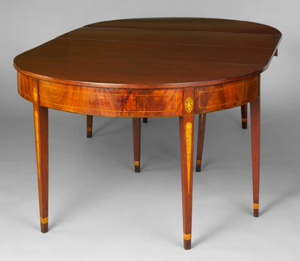
Drop-leaf dining tables, 1795 - 1810
Baltimore
Mahogany, holly with yellow poplar, white pine, sycamore;
28 3/4 x 47 7/8 x 78 1/2 in.
The Metropolitan Museum of Art


Drop-leaf dining table (from above)
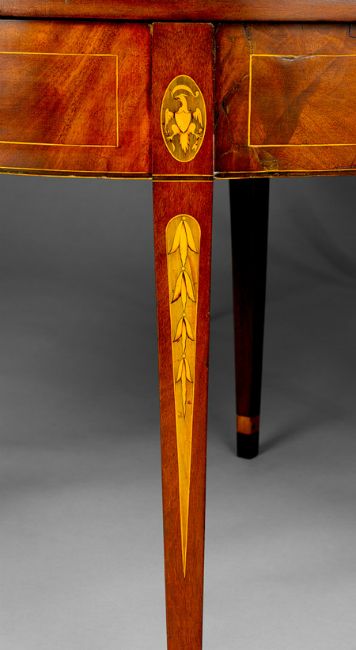
Detail of leg showing the graduated bell flowers
and the American Eagle


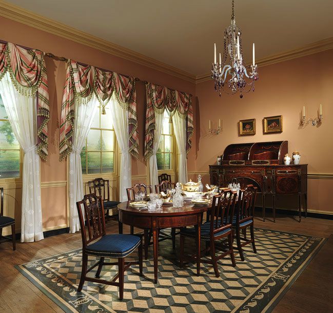
Drawing room of the Craig House, Baltimore, Maryland, ca. 1810
Metropolitan Museum of Art, New York City


Notes from the online exhibit:
The architectural elements of the Baltimore Room are from the parlor of a brick row house built for Henry Craig between 1810 and 1811. The parlor was the most important room in Henry Craig's dwelling devoted to entertaining guests. Accordingly, it contained the finest woodwork, which illustrates a delicacy and restraint typical of the Neoclassical style of the period.
-------------------------------------------------------------------------------------------------------------------------------------------------------------

I usually sit pen in hand while watching PBS' Antiques Roadshow. It is one of the few programs (or places) where old and hidden treasures get revealed.

This past week, the show was from Detroit. We forget that before Detroit deteriorated, it was a wealthy city.

One lovely piece of furniture that showed up at the auction was a Baltimore Federal Era Center Table.


Baltimore Federal Era Center Table
Mahogany
ca. 1790
From the Antiques Road Show, Detroit
Which aired in February 3, 2014


Baltimore Federal Era Center Table
Detail of leg, showing graduated bell flowers


The appraiser says about the table:
They made these Baltimore style tables in the 1880s, 1890s, 1900, 1910. And so they were copies of the original tables.

...The good news is that you have a really fully inlaid table. A really high styled table...We're going to try and figure out now whether its First Period or Second Period...You have period table from 1785 to 1795, maybe 1800, so it's a real thing.

...The legs have graduated bell flowers, which are sand-burnt to make them three dimensional....
This is what I could find out about this style:
In the years immediately following the Revolution, Baltimore became an important port, and a school of cabinetmaking flourished there during the Federal period [1780-1820]. Elaborate pieces of painted furniture made the Baltimore pieces’ sophistication and grace hard to match. In addition to the painted furniture, Baltimore was known for its use of églomisé (glass panels with symbolic figures) and large ovals inlaid in mitered panels. Like Baltimore, Annapolis also became an important Maryland cabinetmaking center. The most prominent craftsman was John Shaw. A labeled mahogany bookcase-desk by John Shaw was made in 1797 and formerly stood in the Kennedy Green Room in the White House. It is now is shown in the Diplomatic Reception Room. The Maryland State House holds a desk for the President of the Senate made by John Shaw in the same year. [Source: Bartley Classic Reproductions]
And:
Baltimore furniture, decorated with paint or fancy wood inlays, and beautifully detalied Baltimore silver of this period [the Federal era] took their places in the forefront of American design. The merchants=craftsmen John and Hugh Finlay typified the trade; they advertized in 1803 that they had for sale but would "also make to any pattern all kinds of fancy and Japanned furniture." Their wares and shop skills ran to car, pier, tea, dressing, writing and shaving tables; stands for candles and washpans; bedsteads along with bed and window cornices; cane-seat, rush-seats and Windsor chairs; and fire and candle screens "with or without views adjacent to the city." In this flush time of European war and Baltimore profit, the wealthiest Baltimoreans could afford interiors, furnishings and finery that spoke clearly of personal and family taste. [Source: The Architecture of Baltimore: An Illustrated History. Mary Ellen Hayward and Frank R. Shivers, eds. John Hopkins University Press, 2004. P. 29. Full Text Online, here]
General information from Wikipedia:
Federal furniture refers to American furniture produced in the Federal Period, which lasted from approximately 1789 to 1823. Notable furniture makers who worked in the federal style included Duncan Phyfe and Charles-Honoré Lannuier. It was influenced by the Georgian and Adam styles, and was superseded by the American Empire style...

Pieces in this style are characterized by their sharply geometric forms, legs that are usually straight rather than curved, contrasting veneers, and geometric inlay patterns on otherwise flat surfaces. Pictorial motifs, when extant, usually reference the new federal government with symbols such as the eagle. [Source: Wikipedia]


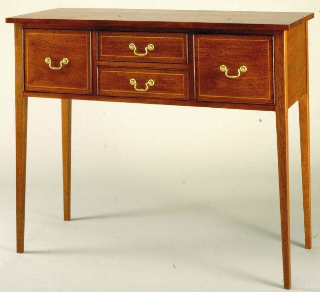
Contemporary version of a Federal Style side board
At Bartley Classic Reproduction


The full Antiques Roadshow video is here. The section on the center table appraisal starts around the 8 min. point.
-------------------------------------------------------------------------------------------------------------------------------------------------------------
Posted By: Kidist P. Asrat
-------------------------------------------------------------------------------------------------------------------------------------------------------------