Toward Resilient Architectures 3: How Modernism Got Square Michael W. Mehaffy and Nikos A. Salingaros.
MetropolisMag.com
Blog Point Of View
March 22, 2013
As we enter a transition era that demands far greater resilience and sustainability in our technological systems, we must ask tough new questions about existing approaches to architecture and settlement. Post-occupancy evaluations show that many new buildings, as well as retrofits of some older buildings, are performing substantially below minimal expectations. In some notable cases, the research results are frankly dismal [see "
Toward Resilient Architectures 2: Why Green Often Isn’t"].
The trouble is that the existing system of settlement, developed in the oil-fueled industrial age, is beginning to appear fundamentally limited. And we’re recognizing that it’s not possible to solve our problems using the same typologies that created them in the first place. In a "far-from-equilibrium" world, as resilience theory suggests, we cannot rely on engineered, “bolt-on” approaches to these typologies, which are only likely to produce a cascade of unintended consequences. What we need is an inherent ability to handle "shocks to the system", of the kind we see routinely in biological systems.
In "
Toward Resilient Architectures 1: Biology Lessons", we described several elements of such resilient structures, including redundant ("web-network") connectivity, approaches incorporating diversity, work distributed across many scales, and fine-grained adaptivity of design elements. We noted that many older structures also had exactly these qualities of resilient structures to a remarkable degree, and in evaluations they often perform surprisingly well today. Nevertheless during the last century, in the dawning age of industrial design, the desirable qualities resilient buildings offered were lost. What happened?
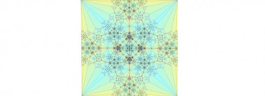
Figure 1. The fractal mathematics of nature bears a striking resemblance
to human ornament, as in this fractal generated by a finite subdivision rule.
This is not a coincidence: ornament may be what humans use as a kind of “glue”
to help weave our spaces together. It now appears that the removal of
ornament and pattern has far-reaching consequences for the capacity
of environmental structures to form coherent, resilient wholes.
Image: Brirush/Wikimedia. A common narrative asserts that the world moved on to more practical and efficient ways of doing things, and older methods were quaint and un-modern. According to this narrative, the new architecture was the inevitable product of inexorable forces, the undeniable expression of an exciting industrial "spirit of the age". The new buildings would be streamlined, beautiful, and above all, "stylistically appropriate".
This was the thinking that gave birth to the modernist style and form language, still popular with architects today and part of a design movement that in various forms has dominated the world for a century. But such choices of style and type are not independent of how well our buildings perform on criteria of sustainability and resilience — a growing body of evidence is damning. So what does recent science tell us about the soundness of this approach to architecture?
Science forces us to conclude that the modernist view of environmental structure itself appears un-modern — and unsustainable. It rests upon now largely discredited theories of culture, technology, environmental geometry, and building form; theories that have never been properly re-assessed by their proponents.
Far from being an inevitable product of inexorable historical forces, the evidence reveals 20th century design to be developed as a series of rather peculiar (historically highly contingent) choices by a few influential individuals. The story goes back to a small group of German, Swiss, and Austrian architect-theorists, and at its seminal moment, the particular ideas of one of them regarding ornament — which turns out to have far-reaching implications.
Adolf Loos’ idea takes holdIn his famous essay of 1908, "Ornament and Crime", the Austrian writer/architect Adolf Loos presented an argument for the minimalist industrial aesthetic that has shaped modernism and neo-modernism ever since. Surprisingly, he built this argument upon a foundation that is accepted today by almost no one: the cultural superiority of "modern man" [sic], by which he meant Northern European males.
Loos proclaimed that, in this new era of streamlined modern production, we had apparently become unable to produce "authentic ornamental detail". But are we alone, he asked, unable to have our own style do what "any Negro" [sic], or any other race and period before us, could do? Of course not, he argued. We are more advanced, more "modern". Our style must be the very aesthetic paucity that comes with the streamlined goods of industrial production — a hallmark of advancement and superiority. In effect, our "ornament" would be the simple minimalist buildings and other artifacts themselves, celebrating the spirit of a great new age.
Indeed, the continued use of ornament was, for Loos, a "crime". The "Papuan", he argued, had not evolved to the moral and civilized circumstances of modern man [sic]. As part of his primitive practices, the Papuan tattooed himself. Likewise, Loos went on, "the modern man who tattoos himself is either a criminal or a degenerate". Therefore, he reasoned, those who still used ornament were on the same low level as criminals, and Papuans.
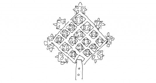
Figure 2. Ethiopian silver ceremonial cross, carried in liturgical processions,
represents a mathematically sophisticated fractal. Was Loos implying that
observers of such millennial religious practices the world over — dependent
as they are upon ornamented ritual, artifacts, chant, music, and dance —
are no better than "criminals"?
Drawing by Nikos Salingaros.Built on an essentially racist worldview, Loos’ seminal essay codified a fateful series of four tenets that have seeped into design culture and remain largely unquestioned, even today:
1. Geometrical fundamentalism. The march of technological progress inevitably compels the elimination of detailed or ornamental features, and focuses on features that nakedly display (and celebrate) technological expediency and geometrical reduction.
2. Tectonic determinism. The geometric character of any addition to the built environment can only be a unique expression of its own specific technological moment in history (defined in stylistic terms, of course).
3. Typological prejudice. It follows that all previous architectural geometries of older eras are wholly inconsistent with modernity, and must be marked for elimination. Revival — a constant evolutionary fugue throughout the greatest civilizations — is now rejected, for the first time in history.
4. Modernist exceptionalism. Civilization has arrived at a fundamentally different and superior cultural status, elevated beyond previous historical constraints by its powerful technology. Architecture will serve this technology most appropriately by drawing from a limited form language derived from early 20th century production technology. No other form language is valid or "authentic".
What was this limited form language? It employed the repetitive production of standardized machine components, conceived in the most limited sense (eliminating complex artifacts, tools and utensils, and complex architectural components). It was an extreme strategy to exploit economies of scale and quantity to achieve efficiencies. Those industrial parts — blank flat sheets, razor-straight line cuts, simple unadorned squares, cubes, and cylinders — were standardized to allow for easy and low-cost assembly.
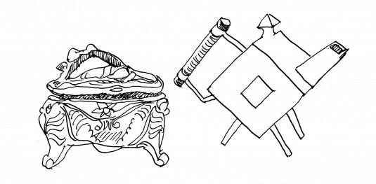
Figure 3. Some holes were evident in Adolf Loos’ theories,
even at the time they were written. On the left, mass-produced Art Nouveau
silver jewelry box by P. A. Coon, 1908. On the right, hand-made Machine Aesthetic
silver teapot by C. Dresser, 1879. The machine aesthetic was an artistic
metaphor of "modernity" chosen by Loos — not a true functional requirement.
Drawing by Nikos Salingaros.Precisely because of its limitations, this form language made for dramatic, somewhat disquieting new shapes, readily suited to metaphoric use as the attention-getting expressions of a great new age. The raw, simple forms were well suited psychologically to the streamlined shapes of the breathtakingly fast-moving new vehicles like locomotives, aircraft, and ships. In turn, these reinforced the idea of streamlined buildings as a metaphoric style — although, of course, buildings do not actually move.
In an age enthralled with the promise of the future, this radically novel form language became unexpectedly popular and entirely displaced its contemporary competitors, many of which are largely forgotten today. Innovative architectural form languages that emerged included Jugendstil, Sezessionstil (Vienna Secession), Art Nouveau, Stile Liberty, Edwardian, and Art-and-Crafts as well as the early F. L. Wright. In fact, Loos was specifically attacking the relatively innovative forms of Art Nouveau — not the over-the-top rococo work of late Victorian designers, as some assume today.
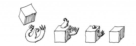
Figure 4. "The cube ate the flower": how the machine aesthetic
devoured all other form languages, from "Architecture for Beginners"
by Louis Hellman, 1994.
Adapted and redrawn by Nikos Salingaros.Corporate branding with science fiction The clever use of machine parts production, through the early application of industrial technology, as a romantic new form language was not lost on Loos’ German contemporary Peter Behrens. Known now as "the father of corporate branding", Behrens recruited industrial minimalism as an aesthetic tool to create a streamlined marketing image to help his client AEG (Germany’s version of General Electric) sell its products. He created striking logos, stationery, advertisements — and buildings, which, in effect, were converted into giant billboards to help to sell the companies and their products.
In taking this momentous step, Behrens was masterfully solving a critical problem for environmental designers offering their services in a new age of standardization and mass production. If we were no longer going to generate the form of buildings in place, through localized craft-like processes, but must rely instead upon (supposedly superior, and certainly cheaper) combinations of standardized parts, then how were we, as designers, going to create aesthetically distinctive works? By "theming" them with an exciting stylized vision of the future to be created by industry (and specifically, by the client company, and by the currently-employed design firm).
So we would turn buildings and objects into canvases to "brand" our companies and our own talents as visionary designers, leading civilization into a thrilling new age. More than that, these packaged designs would have the special allure, in the skilled hands of Behrens and his artistically minded protégés, of a great new fine art. At its heart were industrial manufacturing and the commodification of products.
Working from the self-imposed limitations of this new aesthetic minimalism, the image that Behrens created was of power, industrial might, order, and cleanliness. Above all, it was the promise of a wonderful new technological future. His brilliant recognition paved the way for a dominant theme of modern marketing — one that can sell almost anything if it’s successfully linked to romantic imagery of the future. The allure of such a product is, by definition, beyond any claim that can be evaluated in the present. It is the selling of hope, dream, and desire — even if it is one that’s destined to quickly tarnish and be discarded. Indeed all the better, for planned obsolescence means another "new, improved" product can be sold in its place.
The seductive power of this futuristic message was not lost on Behrens’ young protégés, each going on to have a profound effect on 20th century design. Their names, Walter Gropius; Charles-Édouard Jeanneret-Gris (later known as Le Corbusier); and Ludwig Mies van der Rohe, are familiar to architects. In fact, architectural students are required to study and copy them in school. In the next decades they would announce their "total architecture" (Gropius) that signaled a "great epoch of industrial production" (Le Corbusier) and "the will of an epoch" that "less is more" (Mies). In the words of their most important theorist and propagandist, Sigfried Giedion, "mechanization takes command". Our buildings must reflect the unavoidable reality of our modern world.
This was not merely a stylistic prescription that one might (or might not) find visually pleasing. It was a complete blueprint for remaking the world according to specific concepts of scale, standardization, replication, and segregation; all codified within a form of visual culture. It became (especially through CIAM, the modernists’ profoundly influential international group) the template for the urbanization and suburbanization that took place rapidly in the U.S. and globally after World War II, and that still continues at an astonishing pace in China, India, Brazil, and elsewhere. The structure of this urbanization has profound consequences, for better or worse, for the use of resources and other critical issues of our age.
From today’s scientific perspective that structure has attributes that ought to provoke deep concern, if not outright alarm. As the urbanist Jane Jacobs famously pointed out a half-century later, the modernist approach did not reflect an understanding of the "organized complexity" of natural and biological systems that underlies human biology, human life, and cities inhabited by human beings. It reflected instead an outmoded and unfounded but totalizing theory of the nature of cities, of technology, and of geometry itself.

Figure 5. The form language of nature is not mechanical
in the "modern" sense. The only known exception:
Donald Duck discovers square eggs,
from "Lost in the Andes" by Carl Barks, 1948.
Redrawn by Nikos Salingaros.More recent scientific investigations reveal the richly complex geometry of living environments — including human ones. The geometries of those natural structures "evolve in context" as complex adaptive forms, through a process known as "adaptive morphogenesis". As a result of that process, living geometries have particular characteristics. They differentiate into a range of subtly unique structures, and they adapt to local conditions, giving such environments stability and resilience. They achieve great complexity and efficiency through their evolution — and great beauty, in the form of a perceivable deeper order.
A new view of the nature of environmental structure, aesthetics, and ornament Key to resilience is the way different parts of geometry lock together into larger functional (but not rigid) wholes. In the most ecologically resilient structures, they do this by forming symmetries across inter-linked scales. The resulting structure has the hallmarks of adaptive, evolutionary self-organization: redundant ("web-network") relationships, diversity of mechanisms and components, innate ability to transfer information among many different scales, and fine-grained adaptivity of design elements.
There is also evidence from neuroscience and other fields that the aesthetic experience of such structures is not a superficial "psychological" aspect, but rather, a kind of cognitive "gateway" allowing us to experience and react to this deeper order of our environment. The artistic dimension lies in the way this gateway is shaped, and in its resonance with other emotional experiences in life. Creative abstractions are added to — but do not replace — the natural complexity of our world. As conscientious artists working to improve the human environment, our role is to enhance, express, and clarify that complex adaptive order. Certainly, it’s not merely to apply a veneer of visually dramatic gimmicks.
In this picture of things, ornament is far from mere decoration. It is a precise category of articulation of the connections between regions of space by the human beings that design them. It can be thought of as an essential kind of "glue" that allows different parts of the environment to echo and connect to one another, in a cognitive sense and even in a deeper functional sense. Ornament, then, is an important tool to form a complex fabric of coherent symmetrical relationships within the human environment.
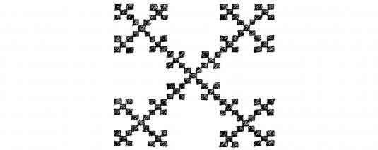
Figure 6. Is this ornamental embroidery?
Actually, a fractal antenna which, when miniaturized,
makes cell phone reception possible. There is an important
role here for functionalism, understood in a much deeper sense.
Drawing by Nikos Salingaros.We are beginning to understand that the industrial form language represented a catastrophic loss of this adaptive structural capacity, bringing with it enormous negative consequences for the environment we inhabit. It deprived us of the thought processes necessary to conceptualize the characteristics of resilient environmental structure — web-network relationships, diversity, linking of scales, and fine-grained adaptivity. As one functional example, a certain kind of cell-phone antenna incorporating ornament-like fractal patterns (see above) offers the best performance for its tiny size but cannot be conceptualized within a minimalist form language.
The big re-thinkWe are now beginning to see a pattern in the momentous changes to industrial civilization of the last century. The excessive reliance on standardization and commodification, the birth of a consumer society dominated by branding and theming, the rapacious and unsustainable consumption of resources as an addictive economic fuel are intimately related to the non-resilience of the form languages that were handed down to us. The products of that related group of form languages are a failing industrial civilization’s "art supply".
True resilience does not result from artistic metaphors, or by sticking veneers over the same failing industrial model.
Biological resilience and sustainability require the capacity to endure, to adapt, and to maintain a dynamic stability in the face of sometimes-chaotic environments. They require the cognitive flexibility that enables the genesis of technological innovations. We will have to think outside the modernist box to find new forms — and new uses for very old forms, just as natural evolution does. It seems clearer than ever that the survival of our planet depends upon it.
Yet we are the heirs of Loos’ erroneous and limiting ideas about geometrical fundamentalism, tectonic determinism, the exceptionalism of modernism, and the typological prejudice rooted in an illusory aesthetic functionalism. All of these dogmas are enforced by self-perpetuating elite privileges, and the proprietary commodification of design as a fashion and brand. Even now, a reactionary old guard, wearing frayed progressive trappings, condemns virtually any use of ornament, pattern, or precedent as reactionary, uncreative, and lacking in imagination.
But in an age that demands new thinking, perhaps it is that attitude itself that betrays the ultimate lack of imagination.
-------------------------------------------------------------------------------------------------------------------------------------------------------------
Michael Mehaffy is an urbanist and critical thinker in complexity and the built environment. He is a practicing planner and builder, and is known for his many projects as well as his writings. He has been a close associate of the architect and software pioneer
Christopher Alexander. He is a Research Associate with the Center for Environmental Structure, Alexander’s research center founded in 1967, and Executive Director of the Sustasis Foundation, a Portland, OR-based NGO dedicated to developing and applying neighborhood-scale tools for resilient and sustainable development.
Nikos A. Salingaros is a
mathematician and
polymath known for his work on
urban theory, architectural theory, complexity theory, and design philosophy. He has been a close collaborator of the architect and computer software pioneer Christopher Alexander. Salingaros published substantive research on Algebras, Mathematical Physics, Electromagnetic Fields, and Thermonuclear Fusion before turning his attention to Architecture and Urbanism. He still is Professor of Mathematics at the
University of Texas at San Antonio and is also on the Architecture faculties of universities in
Italy,
Mexico, and
The Netherlands.
-------------------------------------------------------------------------------------------------------------------------------------------------------------
Posted By: Kidist P. Asrat