
Starbucks has a new "holiday" logo out, which seems to be celebrating Christmas. But it doesn't quite do that.
The main, written message of the logo, instead of saying "share the joy" of Christ's birth, simply tells us to "share joy." What could this joy mean? One million things. Something different for each person. The unified joy that we are to feel around the Christmas season has splintered into the joy each of us feels for whatever reason.
That is one way Starbucks is shifting us away from Christams.
Another way it is relaying its message of a Christmas Holiday without Christmas is through the design of its products, which either distort Christmas symbols, or leave them out all together.
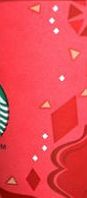
Here is the Starbucks paper cup for this "holiday season":
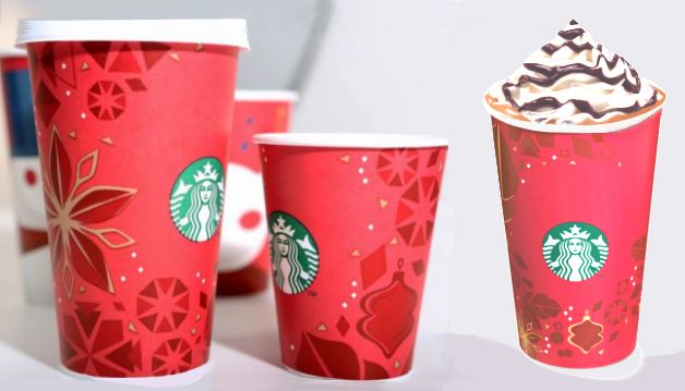
1. What looks like a star on the left cup could just be a sparkly tree decoration shaped in a flower design.
2. The triangular star shapes in the octagons (dispersed around the cup) are too uniform, and there are two of each star ray, making a total of eight. The rays are all the same length.
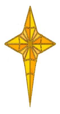
The star that shines in many renditions of Christmas paintings and illustrations has four rays. And the top and bottom rays are longer, with the bottom the longest. This elongated bottom ray connects the star to the earth, to show the spot where Jesus' manger lay. This star is often called "The Star of Bethlehem."

Elihu Vedder (American, 1836–1923)
Star of Bethlehem, 1879–80
Oil on canvas: 36 3/16 x 44 3/4 in
Milwaukee Art Museum
The frantic holiday scene I’ve described is starkly in contrast to the peaceful one we find in Star of Bethlehem created by American painter Elihu Vedder in 1879-80. This painting, currently housed in Milwaukee Art Museum storage, depicts a serene moment in the muted, golden desert. Three figures on camels overlook the path before them, while three shepherd/guides ahead and three behind also survey what lies ahead. Color can be seen in the distance in the green of trees. Above them the sky contrasts what is seen below with a bright light that illuminates the sky. There is a sense of anticipation created by figures that can be seen in the clouds, standing there, backs slightly hunched as they look down upon the earth. [Source: The Milwaukee Art Museum]Here's Rembrandt's (or what is attributed to be a pupil of his) Adoration of the Shepherds, where Jesus is bathed in what is most likely the light from the Star of Bethlehem.
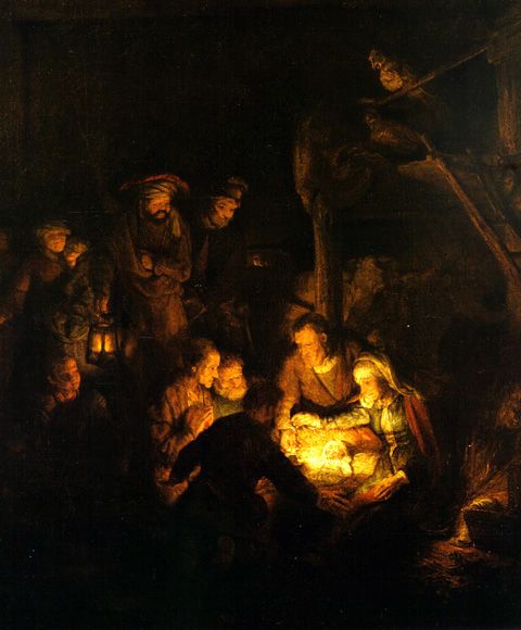
Pupil of Rembrandt, 1606–1669
‘The Adoration of the Shepherds’, 1646
Oil on canvas
Painters and art of various centuries and cultures show the importance of the star as a guiding light, and especially its pointed direction toward the earth to indicate where the infant Jesus lay.
Even popular illustrations, often for cards and hanging pictures, depict the bottom ray of the star pointing downwards. In the image below, the star shows the three kings where the manger lies.

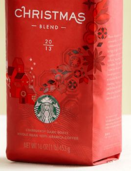
3. Back to the Starbucks cup. The illustrations on the cup are sloppy. They look like they're preliminary sketches, rather than decorations ready for display. Especially irritating is the cone-shaped decoration, which is drawn as an amorphous blob.


4. The leaf at the bottom of the smaller cup is not that of a pine tree, nor does it look like a holly, the traditional leaf for most Christmas decorations.
It is a coffee plant leaf, and the nut-like shape, a coffee bean. Starbucks' marketing strategy, is to commemorate this "holiday" season through coffee rather than through Christmas.
The Starbucks Christmas cup is all about the coffee and very little about Christmas.
5. Shapes are scattered around the cups, as though to fill in gaps. What are the spikey triangular shapes - rays from a star? And the white dots - snow flakes? Why not have sketch of snow flakes, with some of the beautiful shapes?

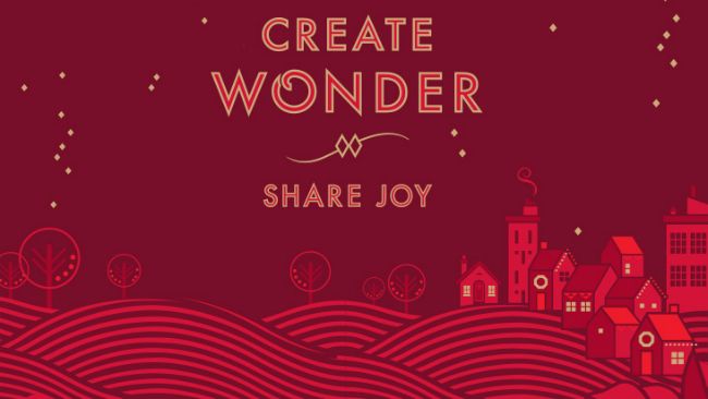
6. The homes we see on the package illustration could be homes on any product cover. They have no Christmas distinction: there is no Christmas tree near the homes; there are no decorations around the houses; there is no angel or star above.
Below is a promotional image from the Starbucks website, showing the homes and their surroundings. There is no Christmas tree. The odd, leafless trees are dotted with what could be lights, but it could just be any kind of graphic embellishment. The homes have what look like lights framing the roofs, but it isn't enough to indicate Christmas lights. And the diamond-shaped objects in the sky could be stars, but there is no unique, distinct Star of Bethlehem to show that this is a Christmas scene, and not just any winter scene.
And we are invited to "create wonder," as though we have supernatural powers. What kind of wonder do we create? Again, whatever strikes our fancy, creators that we are. Like the message "Share Joy," what we create, and the joy that we share, are not related to the Christmas story, but rather, our very own individual fancies.
And finally, here is the description of the Christmas Blend mixture, from the Starbucks website:
A time to create wonder. An invitation to share joy.Of course, coffee is a Third World export. But, the description above tells us that it is part of Starbucks' "sourcing" strategy.
Three decades ago, we created something wonderful - a coffee special enough for your celebrations big and small. Christmas Blend brings bright, lively Latin American coffees together with smooth, mellow Indonesian coffees, including rare aged beans from Sumatra. The aged coffee dramatically balances the overall flavor to create luscious, sweet, spice notes. Crafting this coffee embodies the best of everything we do - sourcing, roasting, blending, exploring, perfecting and sharing. It’s one of our most cherished traditions - made for you to savor season after season.
Dictionary.com defines "sourcing" as:
...the buying of components of a product from an outside supplier, often one located abroadAnd Starbucks tells us how it does this "ethically":
Ethical SourcingThis sounds too much like the "Banana Republics" that developed through vast farmlands being allocated for big business plantations, while local farmers had to do with inferior land.
We've always believed in buying and serving the best coffee possible.
And it's our goal for all of our coffee to be grown under the highest standards of quality, using ethical trading and responsible growing practices. We think it's a better cup of coffee that also helps create a better future for farmers and a more stable climate for the planet.
With the help of Conservation International, we’ve developed ethical sourcing guidelines that help us purchase coffee that is responsibly grown and ethically traded.
We’re working directly with farmers to develop responsible growing methods and investing in their communities to ensure a sustainable supply of quality coffee.
In this Starbucks produced video, Carlos Mario (no last name), who is clearly an intermediary between Starbucks (the corporation) and the local Costa Rican farmer, talks about the farmer and coffee production. This Third World company man says:
We are helping farmers, teaching them how to improve production, improve the quality, and reduce the use of pesticides. We are taking care of the environment and the pretty country that we have. Helping farmers is really good, and I feel really proud of that. I think Starbucks is working with agronomists because they know that if they don't care about the environment, they will not have good quality coffee in the future."All Hail King Coffee!
Below is Toik Wolf, the cup's designer saying "All Hail King Coffee."
I found his quotes after I wrote my design break-down above. Wolf is saying almost to the word what I've written about the cup design. Of course, he thinks it is a Good Thing, while my analysis is a lament. This shows further that the deconstruction of Christmas is systematic and deliberate by the likes of Wolf and Starbucks, and not some random aesthetic project:
On The Design Process
Toki Wolf, Creative Director, In-store Promotions:I like coffee, and I especially like Starbucks' blends. There is no doubt that its the "King of Coffee." I wish its leader would just say that they're in the business of making great coffee, and that they work in Third World countries. Let those countries make the necessary steps to help the farmers, while Starbucks provides the coffee for us through a true market and competitive manner.
One of our early idea explorations was treating our core product, coffee, in its agricultural form and seeing if we could apply that in a beautiful way for the holidays. See if it can be meaningful in the holiday timeframe. So, there’s this image, a quick sketch of a coffee plant with coffee cherries coming out of the red cup. We were literally thinking, “If coffee is at the heart of what we do, can that be the foundation where the exploration comes from?” Even in that little sketch form, we thought we might be onto something. We kept going back to it, even after moving on from it and exploring different illustration style. We always went back to the drawing with the red cup below it. It was the basis of the elements that ended up on the red cups and the coffee bags for this year.
So, the idea was to take these coffee cherries and use them as a holiday element – like holly berries. The coffee flower that you see on the cups comes across, as maybe a snowflake, maybe a poinsettia. We start to see these interpretations. Even in the origin patterns, they kind of look like snow in an abstract form. They start to have a holiday feel to them. Once we realized that we could make this work visually in a way that was both authentically Starbucks and authentically holiday, we went for it, and extracted it all the way across all of our holiday elements. We started with the way it can be interpreted, creating the story around it. Going back to that original sketch, it feels like this beautiful holiday moment is coming out of the red cup, literally coming from the coffee. We ended up keeping the element in the swoop. We call it a “story swoop” or “story arch” that kind of flow around the packaging. So, you’ll see that across all of our holiday design elements, including the cups and the coffee packaging.
[...]
This holiday is the next step of the visual journey we’ve been on with the brand. Beginning with the new coffee packaging. We wanted the coffee to be at the center. We wanted it to look like the leader and to elevate above the noise in the coffee category. We wanted to create something that felt right for coffee but was unique and own-able to Starbucks. By doing so, we created this new visual vocabulary around coffee that looks traditional, and looks like it’s rooted in heritage, but yet it’s fresh and new. We haven’t done anything exactly like it - nor has there been anything like it in the category. You’re right. This holiday feels like a natural extension of that [the coffee packaging redesign]. It keeps that momentum going.
And, I wish Starbucks wouldn't tell us to "Share Joy," or to "Create Wonder" if it cannot come right out with "Share the Joy of Christmas." I would rather just have a warm cup of coffee without being pulled into a false sense of the Christmas holiday. It is just coffee, after all.
-------------------------------------------------------------------------------------------------------------------------------------------------------------
Posted By: Kidist P. Asrat
-------------------------------------------------------------------------------------------------------------------------------------------------------------